Typography Basics Every Graphic Designer Should Know
When you look at a poster, Instagram post, logo, advertisement, website, or brochure, what catches your attention first?Sometimes it is the image. Sometimes it is the colour. But very often, it is the text.
The way text looks, feels, and fits into a design can completely change how people understand it. This is where typography comes in.
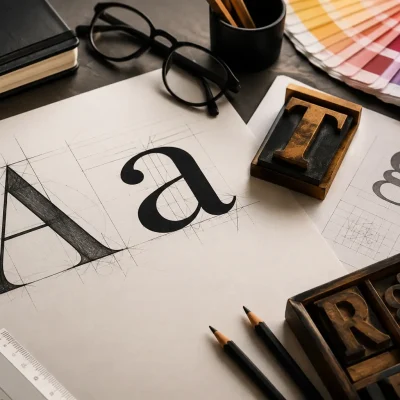
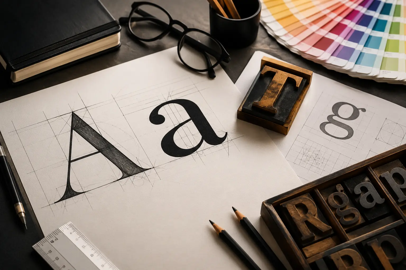
Typography is much more than simply choosing a font. It is about selecting the right typeface, size, spacing, alignment, and arrangement of text to make a design clear, attractive, readable, and visually meaningful.
What is Typography?
- Choosing a font
- Selecting the right font size
- Adjusting letter and line spacing
- Creating a clear text hierarchy
- Aligning text properly
- Combining different fonts
- Making content easy to read
1. Understand Fonts and Typefaces
- Tradition
- Elegance
- Trust
- Professionalism
- Clean
- Modern
- Simple
- Minimal
- Posters
- Headlines
- Campaigns
- Social media graphics
- Creative advertisements
2. Font Size Matters
Subheading – Medium
Body Text – Smaller
Font size should also depend on where the design will be used. A social media post, billboard, brochure, website banner, and business card may all require different typography choices.
3. Learn About Font Weight
- Light
- Regular
- Medium
- Semi Bold
- Bold
- Extra Bold
For example, a designer might use Bold for a headline and Regular for supporting information.
But using too many bold fonts can make a design look heavy and confusing.
The goal is to create balance and hierarchy, not simply make everything stand out.
4. Understand Kerning
Some letter combinations may naturally appear too close or too far apart. A designer can manually adjust the spacing to make the word look visually balanced.
This may seem like a small detail, but professional typography often depends on these small adjustments.
Kerning becomes particularly important in:
- Logo design
- Brand identity
- Headlines
- Posters
- Large display text
5. Understand Tracking
Unlike kerning, which focuses on individual letter pairs, tracking changes the spacing more generally.
For example, increasing tracking can make a short heading look more open and elegant.
- Adobe After Effects
- Adobe Premiere Pro
- Blender
- Autodesk Maya
- Nuke Compositing
- Green Screen Techniques
- Motion Tracking
- Camera Tracking
- Rotoscoping
- Compositing
- 3D Lighting
- Rendering
- Portfolio Development
6. Pay Attention to Leading
If the lines are too close together, a paragraph can feel crowded.
If there is too much space, the content may feel disconnected.
Good leading creates a comfortable reading experience and makes the layout look cleaner.
This is especially important when designing:
- Brochures
- Magazines
- Websites
- Reports
- Editorial layouts
- Social media creatives
7. Create a Clear Typography Hierarchy
A good design should guide the viewer’s eyes.
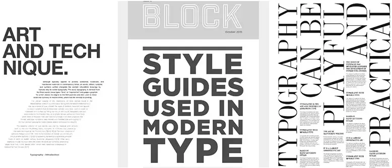
Typography hierarchy helps you decide what the viewer should notice first, second, and third.
A simple hierarchy can look like:
Headline
Big and bold
Subheading
Smaller but noticeable
Body Text
Comfortable and easy to read
Supporting Information
Small but still readable
This technique is useful in almost every area of graphic design, from advertising and branding to digital content and UI design.
8. Do Not Use Too Many Fonts
One of the most common mistakes beginners make is using too many fonts in one design.
Using five or six different fonts does not automatically make a design creative.
In most cases, two or three well-selected typefaces are enough.
For example:
Font 1: Main heading
Font 2: Body text
Font 3: Small accent or highlight
The fonts should complement each other rather than compete for attention.
Remember:
Good design is not about adding more. It is about choosing better.
9. Choose Fonts According to the Design
Every font has a personality.
A playful font might work perfectly for a children’s brand but may not be suitable for a corporate presentation.
Similarly, a formal serif font may look elegant on a luxury brand but might not work well for a modern gaming poster.
Before selecting a typeface, think about:
- Who is the audience?
- What is the purpose of the design?
- What emotion should the design create?
- Where will the design be displayed?
- Is the brand modern, traditional, playful, premium, or professional?
Typography should support the message and visual identity of the design.
10. Focus on Readability
One of the most important rules of typography is simple:
If people cannot read it, it is not good typography.
A creative design should still be easy to understand.
Avoid:
- Very complicated fonts for body text
- Extremely small text
- Poor colour contrast
- Excessive letter spacing
- Crowded paragraphs
- Text placed over busy images without enough contrast
Remember that graphic design is not only about making something beautiful. It is about communicating a message effectively.
11. Alignment Makes a Big Difference
Text alignment may look like a small design decision, but it can completely change the appearance of a layout.
Common alignment styles include:
- Left aligned
- Center aligned
- Right aligned
- Justified
For most paragraphs, left alignment is comfortable and easy to read.
Center alignment can work well for short headlines, invitations, posters, or creative compositions.
The important thing is to use alignment consistently and maintain a clean layout.
12. Understand Contrast in Typography
Typography needs contrast to create visual interest.
Contrast can be created through:
- Size
- Weight
- Font style
- Colour
- Spacing
- Typeface combinations
For example:
BIG HEADLINE
followed by a smaller, lighter paragraph creates an obvious visual difference.
Contrast helps viewers understand the importance of different pieces of information.
13. Typography in Branding
Typography plays a major role in brand identity.
Think about a company’s logo, packaging, website, advertisements, social media posts, and business cards. Consistent typography helps all these elements feel like they belong to the same brand.
A designer working on branding needs to think about:
- Brand personality
- Font selection
- Logo typography
- Brand guidelines
- Typography hierarchy
- Digital and print applications
This is why typography is closely connected to logo design, branding, advertising, and visual identity design.
14. Typography for Social Media Design
Today, graphic designers create a huge amount of content for Instagram, Facebook, YouTube, LinkedIn, websites, and digital advertisements.
Social media designs need typography that can communicate quickly.
A viewer may only spend a few seconds looking at a post.
Therefore:
Keep the headline clear.
Make important words noticeable.
Avoid unnecessary text.
Maintain strong contrast.
Keep the design visually balanced.
Typography can make the difference between someone scrolling past a post and stopping to read it.
15. Typography and Layout Go Together
Typography cannot be treated separately from the overall layout.
A designer needs to understand how text interacts with:
- Images
- Shapes
- Colours
- White space
- Grids
- Icons
- Illustrations
A well-designed layout gives every element enough space to breathe.
This is why layout design and grid systems are important skills for graphic designers. Cosmos Creative Academy’s Graphic Design course also covers design principles, layout designs, grids, typography, advertising, social media design, and packaging.
Common Typography Mistakes Beginners Should Avoid
If you are learning graphic design, keep an eye out for these common mistakes:
❌ Using too many fonts
❌ Choosing fonts only because they look attractive
❌ Ignoring readability
❌ Using poor font combinations
❌ Keeping everything the same size
❌ Overusing bold or decorative fonts
❌ Ignoring spacing and alignment
❌ Using low contrast between text and background
❌ Adding too much text to a design
❌ Forgetting to check the design at its actual viewing size
Avoiding these mistakes can immediately make your designs look more professional.
How Can You Improve Your Typography Skills?
Contact Us
📍 Cosmos Creative Academy, Chinchwad P-430/431, Phase I, Mayur Trade Center, Pimpri-Chinchwad, Maharashtra – 411019
📞 +91-87676 32890 ✉️ info@cosmoscreativechinchwad.com
🕐 Mon–Sat: 9:30 AM – 7:00 PM